Tales from the Loop: In the Shadow of the Monolith
Chapter 6: Print Tests
From Screen to Wall
The process of Tales from the Loop had already led me to think about how I might eventually display the images—experimenting with printing, projection, and scale. I touched on some of these ideas in a previous post: When Apathy Strikes.
Among all the photographs, I kept returning to the image of the four chimneys. If I were to print just one image from the series, it would be that one. Its ambiguous, dominating presence resonated with me, echoing the mood and narrative I was beginning to build within The Loop.
Building on My Background in Retouching
With an extensive professional background in commercial retouching—working on campaigns for both online and print—I already had a strong understanding of how to take images off the screen and onto the wall. This gave me confidence to dive straight into the process of test printing, rather than approaching it as something entirely new.
Choosing the Right Paper
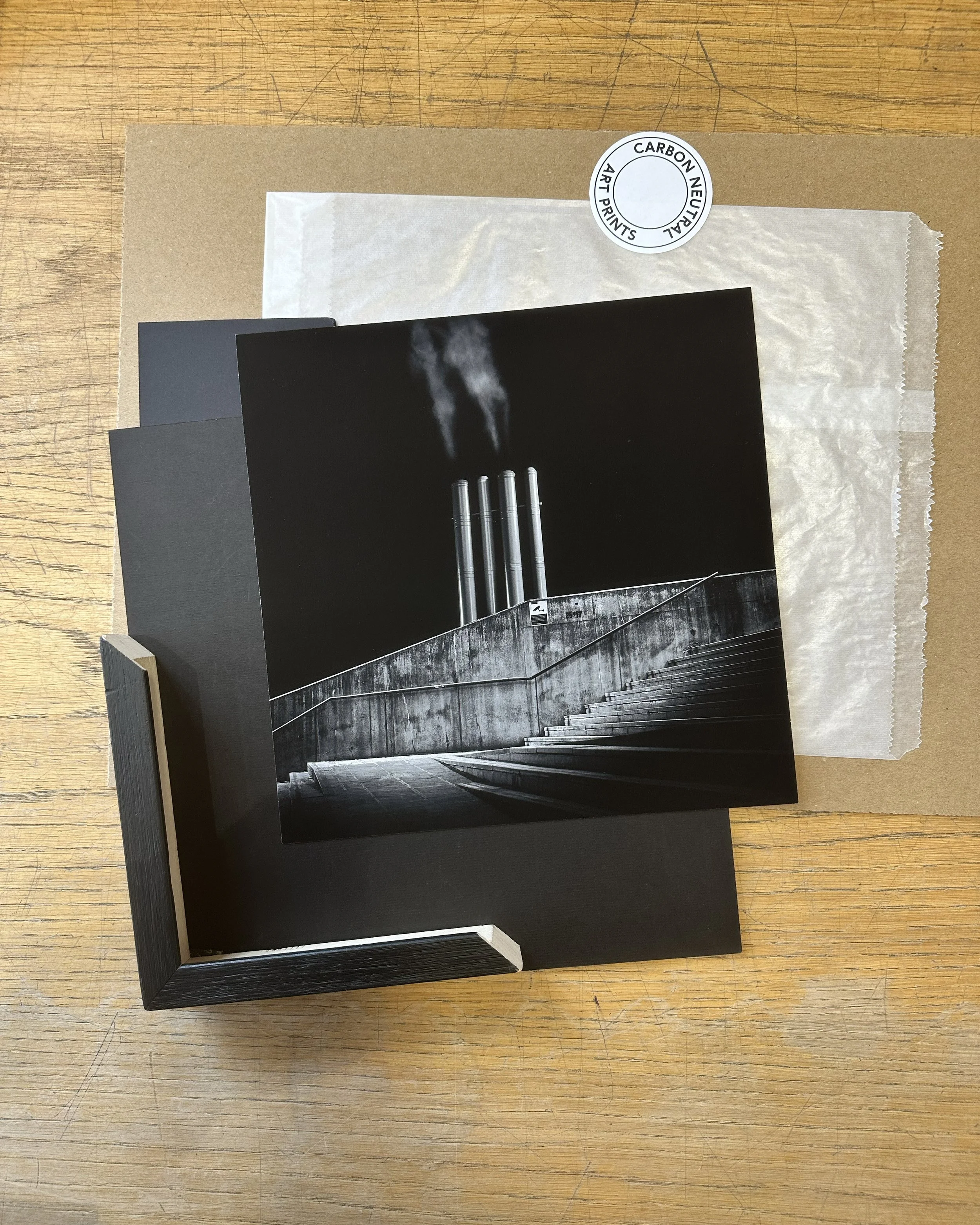
My first step was to order a paper sample pack from The Print Space in London—a company I’ve used many times—and download their ICC print profiles. The sample pack is invaluable: it allows you to compare papers side by side and get a real sense of how different surfaces and finishes affect the final look. This stage can often help crystallise exactly how you want your work to be experienced.

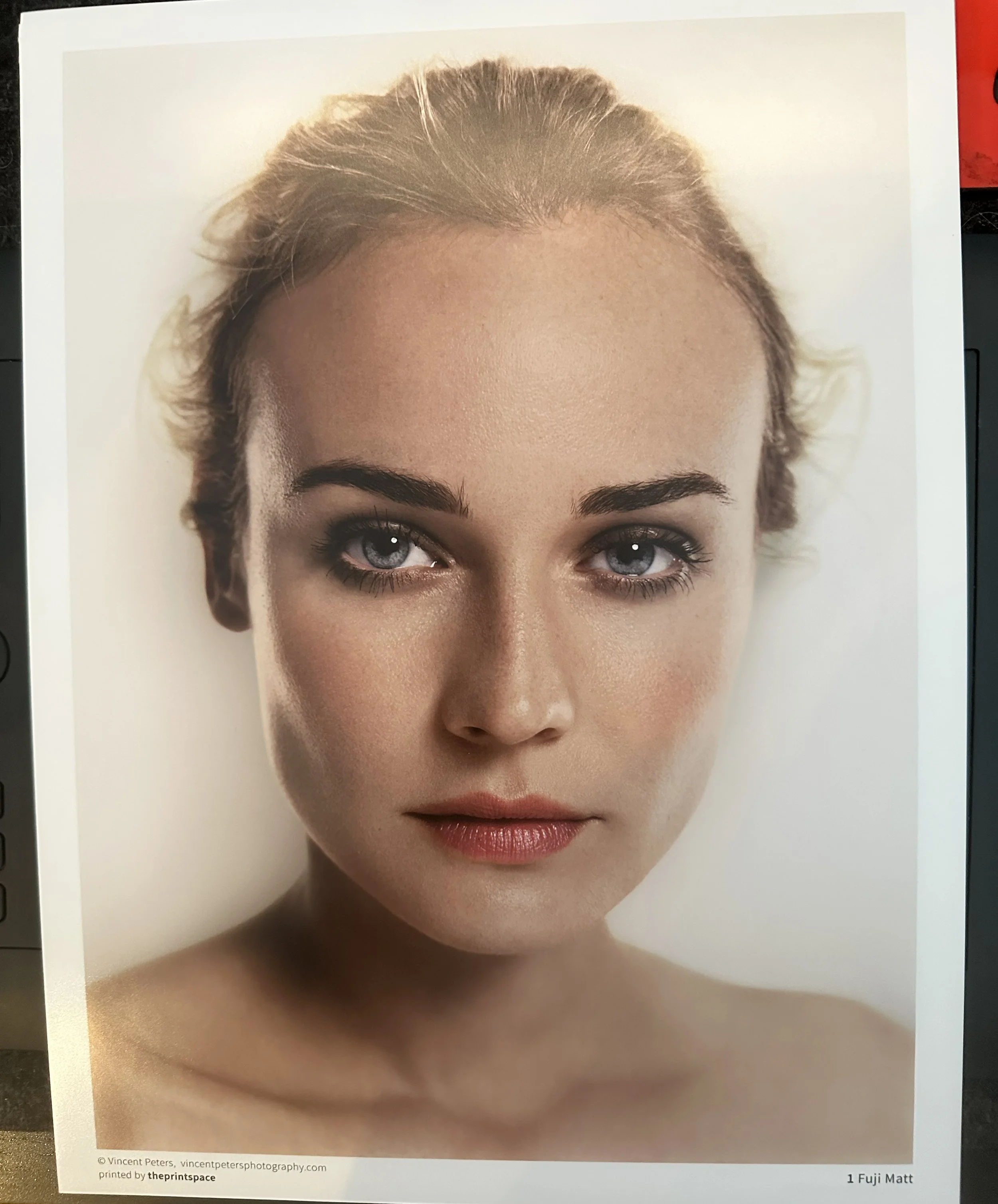
Sample Paper pack from The Print Space

Studio Visits and Unexpected Inspiration
As part of the MA course, we visited a number of artists’ studios. On this occasion we toured Bankley Studios in South Manchester, home to our tutor Sylvia Waltering and BA lecturer Polly Palmerini.
While speaking to Polly about her practice, I noticed the print Equilibrium from her project Make a Vessel on the wall. I was instantly struck by it: the blacks were so rich and deep, contrasting beautifully with the whites. The ink appeared almost powdery, as if sitting on top of the paper rather than fully absorbed into it, giving the image a tactile, physical quality. The float-mounted framing without glass also really elevated the work.
Discovering the Right Paper: Hahnemühle Photo Rag
I later learned that Equilibrium was printed on Hahnemühle Photo Rag, a cotton-based fine art paper widely favoured by photographers for its texture and ability to hold rich tonal detail. I dug out the same sample from my Print Space pack and instantly knew I had to test my chimney image on it.
From Soft Proof to First Print
Loading the ICC profile for Hahnemühle Photo Rag into Photoshop, I began soft proofing my image. This process simulates how the photograph will appear once printed on a specific paper, allowing you to make fine adjustments so the tones and contrast translate properly. Once I was satisfied, I sent the file off to The Print Space—hoping the result would look even half as striking as Polly’s print.
Printing: From Test Print to Exhibition Piece
The Image Arrives
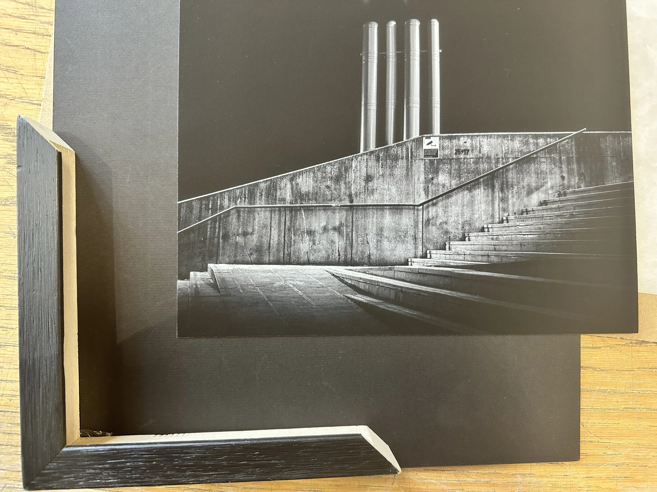
After an anxious wait (though The Print Space delivered within just three days), the print finally arrived. Thanks to their ICC profiles and careful soft proofing, it came back exactly as it looked on my screen. I had been warned by several people that, while Hahnemühle Photo Rag was a beautiful and fitting choice, it’s also notoriously unforgiving—if you touch the surface, the ink will mark.
I carefully slid the print from its sleeve and knew instantly that it was exactly what I had hoped for: deep, rich blacks, delicate detail, and a surface that felt both fragile and precise.
Framing the Work
The next step was framing. Not knowing much about the process, I did the most important thing: I asked professionals. (If there’s one piece of advice I can give, it’s this—speak to and listen to the professionals.)
I took my print to Frames Didsbury and discussed my vision. After looking at different frame and mount combinations, I eventually placed my order—choosing, of course, the most difficult mounting type for a Hahnemühle Photo Rag print that was 80% black and just waiting to be marked.

The Final Print
For this test I chose a 10x10 inch print, though part of me longed to see it at 40x40 inches. As a first step toward potential sales and a wider series, the smaller scale made sense.
When the call came to collect it, I unwrapped the frame at home and was struck by how the image transformed. Because of the depth of the black areas, I had opted for non-reflective art glass—a decision that proved essential. Standard glass would have caused distracting reflections, undermining the immersive quality of the piece.
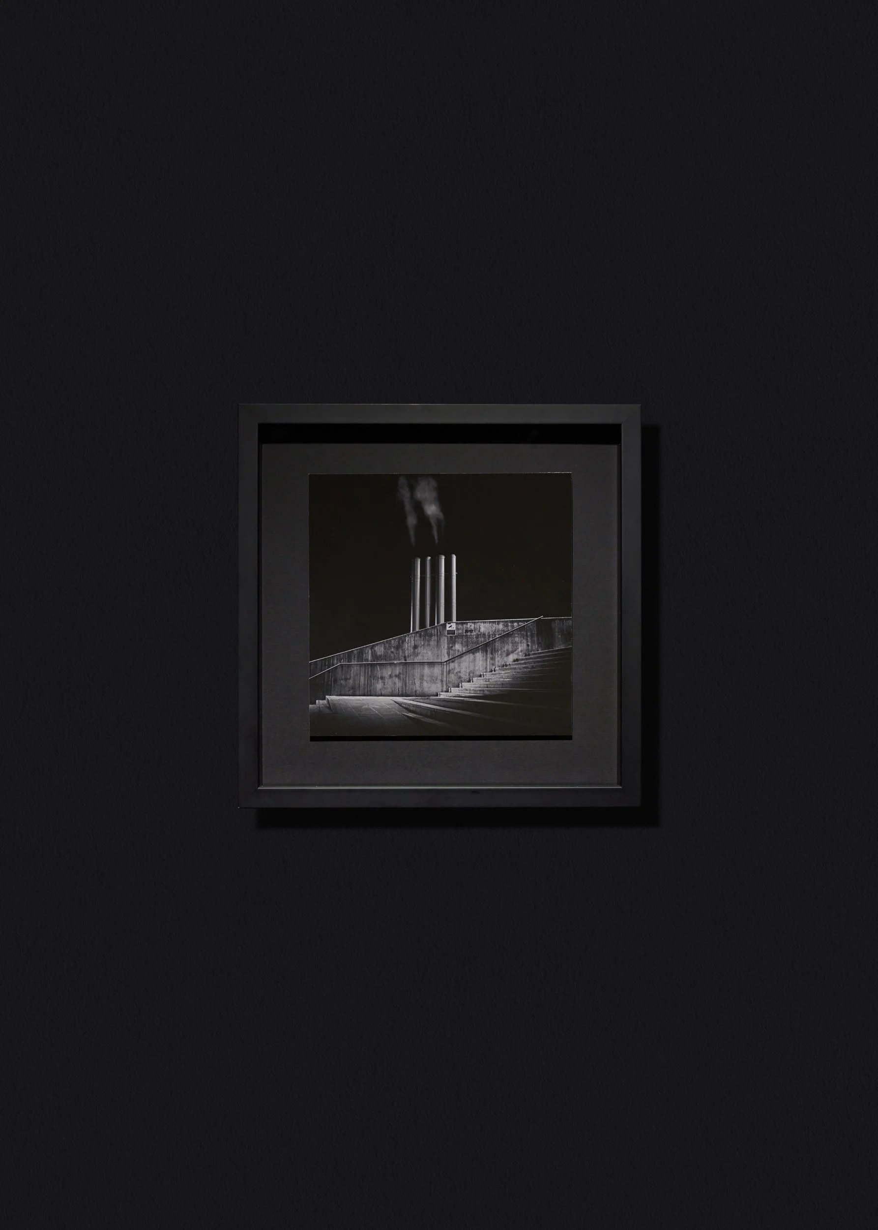
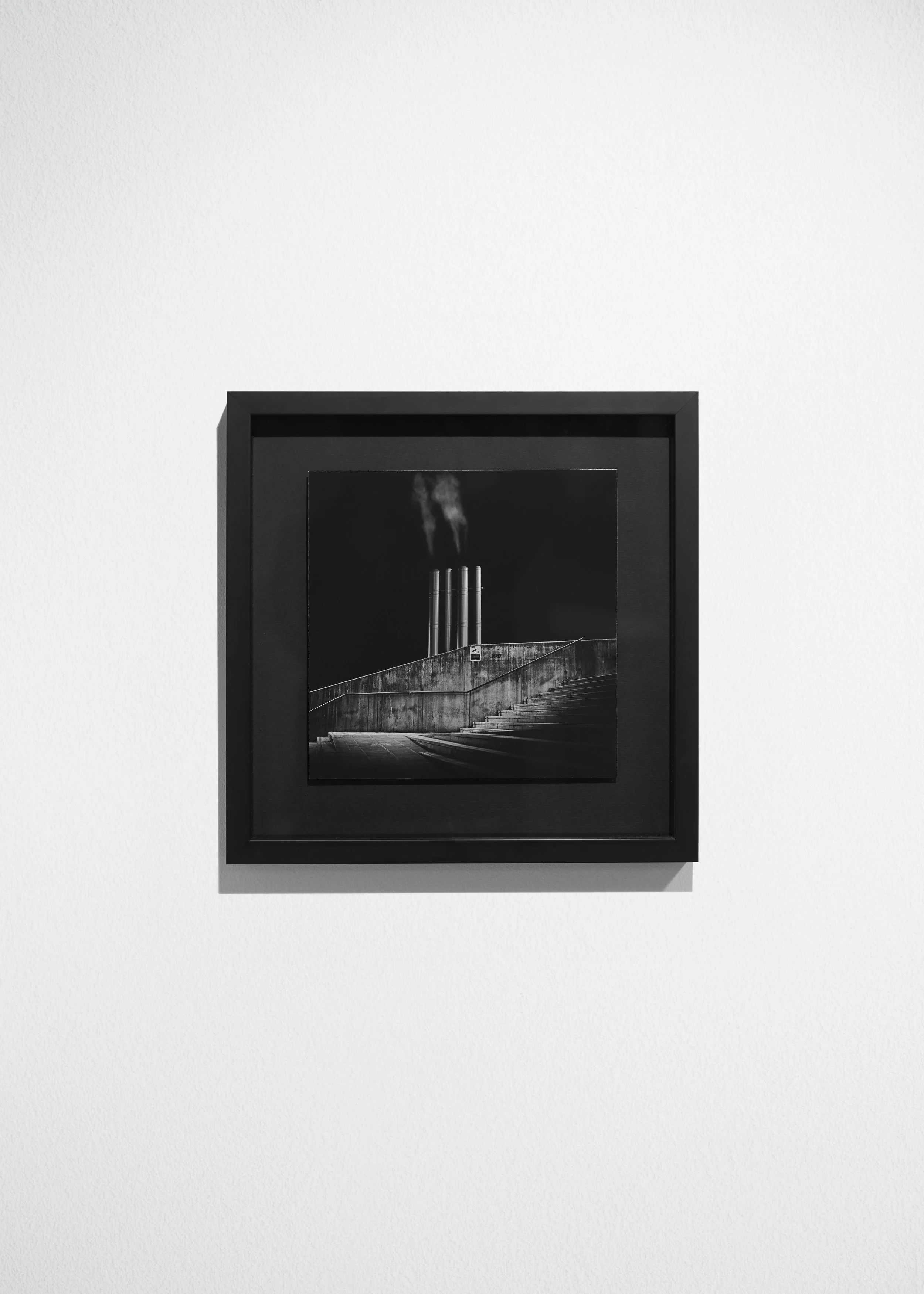
In the Shadow of the Monolith
Seeing the finished work on the wall was powerful. The four chimneys stood like a monolith of the industrial non-place, echoing the typological rigour of Bernd & Hilla Becher’s Basic Forms (Fraenkel Gallery link) and the sculptural lightplay of Dominic Hawgood’s Shrine (see here).
This print was later selected for the Viewpoints Exhibition at Manchester Metropolitan University, where it was displayed under the title In the Shadow of the Monolith. To accompany it, I also released a limited edition print on my website: In the Shadow of the Monolith – Limited Edition.
From The Loop to Tales from the Loop
Reflecting on the image, I felt an enormous sense of pride. It had grown beyond a test print into something far more resolved. Yet, at the same time, I couldn’t shake one small regret—I wish I had pushed for that large-scale 40x40 inch print.
As I considered where The Loop might go next, I turned to reading: four novels by Cormac McCarthy, alongside theoretical texts that pushed me to think about whether the project had more to give, or whether it had already fulfilled its purpose. What I know for certain is that the process of printing and exhibiting this work marked a pivotal moment in shaping what would eventually become Tales from the Loop.